- 2,920
- 4,978
- Joined
- Mar 29, 2020
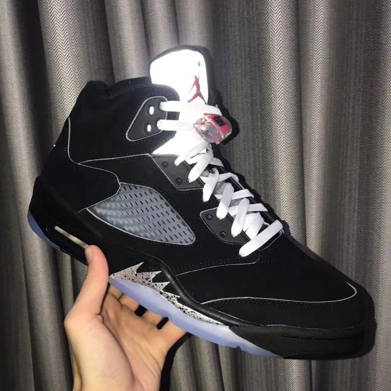
Some of you on drugs these Falcons jerseys are money. An all time classic color scheme, simple and clean, doesn't try to do too much. Don't know what else you can ask for.
Follow along with the video below to see how to install our site as a web app on your home screen.

Note: this_feature_currently_requires_accessing_site_using_safari
Some of you on drugs these Falcons jerseys are money. An all time classic color scheme, simple and clean, doesn't try to do too much. Don't know what else you can ask for.


No, that ATL looks so dumb. ****in arena football look. ATL across the chest would have been cool in 2004.
 . The retro throwbacks with the black helmets are also one of my fav jerseys ever too so kinda was hoping they'd go that direction.
Pretty trivial. The real mistake is the number font. People just got sucked into group think really bad.
Yall saw "worst jerseys in the league" trending when they were unveiled, and now yall gotta fight on on that opinion.
They looked a little meh in the media press release last spring but they were never an abomination. Turns out they actually look pretty damn good on the field.
No, that ATL looks so dumb. ****in arena football look. ATL across the chest would have been cool in 2004.
^Naa I just don't think they're anything special at all personally
Was probably my most disappointing redesign from this last off season but that might have to do with the fact that it looks like I'm one of the rare few who didn't mind the previous jerseys
They look decent on field and I won''t knock anyone who likes them but just a bit generic/create-a-team for my own tastes.
Feels a little too much like what Cleveland tried a few years ago to 'modernize' and I thought those were terrible before they switched back to the classics this season
I don't mind the numbers, I hate the big ATL across the chest. It's hideous and it's the first thing I see.
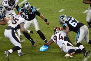
Falcons should have brought back their 80s jerseys and brought back red helmets. It's that simple.
Worst jerseys on the field yesterday were the Cardinals and it's not even close.
If the chargers had white pants their uni would’ve been *chefs kiss*
If the chargers had white pants their uni would’ve been *chefs kiss*
I thought the same thing today I generally can't stand the color yellow.
Broncos are one of the worst.
Giants low key pretty bad with those gray pants, whole thing looks mismatched.

Really want to see the Giants go back to the 80s look.Both of y'all are psychotic, those yellow pants combo was perfection.
I think the Giants have moved to the white pants full time with blue jerseys, still grey for the white jerseys. Giants need a refresh asap, they have one of the worst.
Jimmy G ain’t it.
B-list Jared Goff.
shoulda traded for Brady
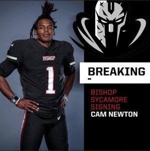
Cam on the 49ers would have been interesting... HahaBrady sucks, should have went for Cam. I would take Jameis over Brady too.
What does Dallas do with Rayne Dakota if they miss the playoffs?