Air Jordan 13 "Flint" May 30, 2020

I think the confusion with rocking the shoe and making em look fresh with a fit comes from rocking the tongue out. 13’s are already a higher cut shoe so when you pop the tongue out on em it makes you look like a cartoon character
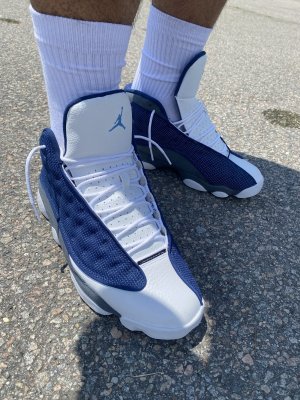
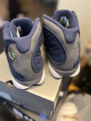
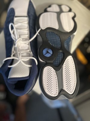
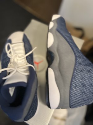
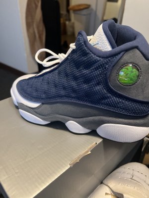
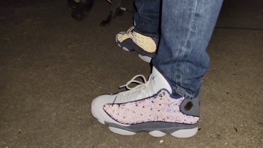
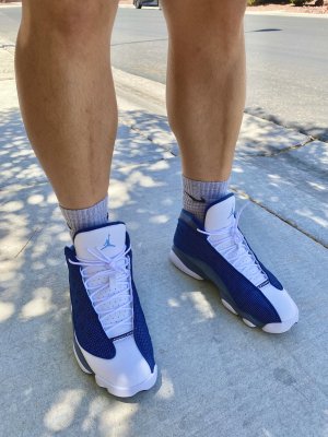
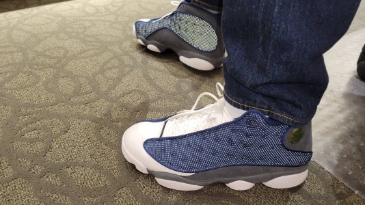
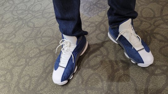
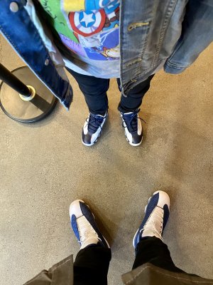
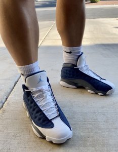
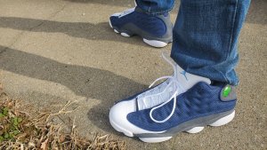
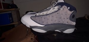
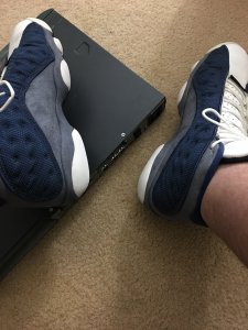
This. 13s are the only shoe I will only wear with pants. And tongues on any shoe should never be ‘popped’ out. Although 13s are a shoe where the tongues should always be specifically tucked in.
 
Do I cop these or restore 2005s? IMO the 13s were one of the only pairs where the shape actually got worse after the remastered program kicked off. Although they are at least more comfortable than the 2010-2011 pairs.
 
Idk. Something is off but I’ve been wanting this shoe for a while so I’ll probably cop. How’s y’all feel about the 3M tho? Looks similar to the blk/reds
 
Had the OGs back in ‘98. The colors on this version look pretty damn close to me. Was really hoping they would fix the liner-wrapping-over-the-tongue problem. And THIS:

A207E1C0-29CB-4410-AB24-46DA817AE2C7.jpeg

Retro ^

17C84125-D13E-4249-8DF6-10FD52DB86D5.jpeg

OG^

Bugs the hell out of me, and might be a deal breaker, but maybe I’m in the minority here. :lol:
 
God the red on the OG was amazing compared to the 2017's. I get the shape is off, but it isn't stopping me from copping these.
 
Good to know I’m not the only one noticing this discrepancy. It doesn’t make a huge difference on the White/Black or Playoffs, but it’s obvious on the other 3 high-cut OG color ways. I actually returned the 2017 Blk/Red after putting them side-by-side with my ‘04.

1374B767-2083-49F5-81D2-09C56D57FC79.jpeg E0182403-9241-476C-87ED-BC8AF40F0D75.jpeg
 
Last edited:
Good to know I’m not the only one noticing this discrepancy. It doesn’t make a huge difference on the White/Black or Playoffs, but it’s obvious on the other 3 high-cut OG color ways. I actually returned the 2017 Blk/Red after putting them side-by-side with my ‘04.

1374B767-2083-49F5-81D2-09C56D57FC79.jpeg E0182403-9241-476C-87ED-BC8AF40F0D75.jpeg
You might be the only to talk about this detail idk. But it def was the first thing I noticed when I put my pair next to the 04 pair. I had these originally also. That dip in the suede cut is a huge difference. It almost appears that JB didnt even pay enough attention to this.
 
You might be the only to talk about this detail idk. But it def was the first thing I noticed when I put my pair next to the 04 pair. I had these originally also. That dip in the suede cut is a huge difference. It almost appears that JB didnt even pay enough attention to this.
I agree. It seems like an oversight.

This model was a huge part of my rotation back in high school, so I can’t help but notice. I used to ogle and analyze the OG 13s every day back in ‘97-‘98 - back when I had a Jordan shrine of my own. :lol:

C35A58E4-AE2D-4C39-AAA6-9DCC26A0288D.jpeg
 
Last edited:
IMG_20170831_205136.jpg
The inconsistency was on originals as well.

Yea, figured someone would go there. Or here:

D5A007BA-5EDE-4E79-B97D-A4442C9DEBA6.jpeg

But for the most part, they had the dip - at least that’s how I remember it.

EDIT: Maybe it’s not so much where the suede ends to meet the midsole, but the shape of its cut in that area of the shoe. The OG cut had a more rounded shape like a quarter circle, which gives it that dip (even on the shoes where the suede ends a little higher and closer to the toe). The rounded look is more consistent with the overall design of the shoe, in my opinion.
 
Last edited:
Wonder why they started tucking back the tongue material again on the 3s but not these.
 
Back
Top Bottom