I appreciate everyone's patience and feedback. If someone is passionate in their objections to a certain change, that comes from a strong attachment to the community and an investment in the status quo. We're grateful and appreciative of the depth of feeling many of you have for the community. This is not something we're doing
to you, we've been doing this
with you. We invited users to join our beta test weeks ago. Everyone had a chance to apply. Nearly all of those who applied were invited to a test site and nearly all of the feedback we received was positive. We made a variety of improvements based on the feedback we received then, and will continue to do so moving forward.
Different people want different things, and balancing all of the various preferences and use cases for our diverse community is no simple task, but we're not looking to stand idle. We'll continue working with you to improve the experience as best we can.
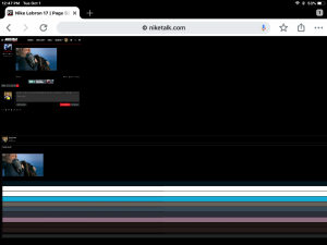
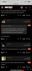
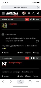
As it seems that some people have already forgotten, this is what NikeTalk looked like on mobile before the change:
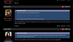
I'm not sure where some of you are getting the idea that NikeTalk mobile had postbits (user avatars, etc.) to the left of posts. That may be the result of a very specific device configuration or resolution and does not reflect the mobile experience that most users had - or would want - on the previous iteration of the site.
There's simply not enough horizontal screen space to indent post content like we do on desktop or landscape mode. Long posts would look ridiculous. Nor did the previous version of the site show a user's reaction totals or join date for mobile users. Some people are complaining that user avatars are massive now (on low DPI devices, presumably) and you can't see many posts without scrolling as it is. If we show all of that information - which was not visible on mobile previously - that problem will intensify.
It reminds me of our last migration, when some users vehemently objected to the changes until they were shown a side by side comparison.
Those of you wondering if anyone actually asked for the thread image gallery feature may want to revisit this thread from 2017:
https://niketalk.com/threads/welcome-to-the-new-niketalk.664249/
I don't need to cherry pick. You can look through that entire thread and see how many people mentioned that feature in particular. It is no exaggeration to say that it had been our top request since the move.
Bear in mind, we have to serve
all NikeTalk users, and this thread is being made in the General forum, which skews much older than our other forums and involves topics that are not as grounded in visual media as sneaker threads. If you're a sneaker fan (and some of you can at least remember what that was like) looking for pictures of the latest colorway of a model you're interested in, gaining this shortcut to see photos - now arranged with the most recently added photos shown first - is a tremendous time saver for you.
There was also a thread comparable to this one in the General forum at the time of our last move filled with complaints as well, in case nostalgia has led you to believe that the 2017 update was somehow universally embraced. As someone that criticism was directed towards, I can assure that it was emphatically
not. Even the move away from Yuku, which had fallen into a state of utter neglect and disrepair by its incompetent owners, was called the "end" of NikeTalk.
We'll continue to make adjustments based on everyone's feedback, just as we did in 2017, and in 2012. Page numbers will return this week in forum view on mobile. We're going to look at making the "full width" option the default on desktop, so it doesn't have to be selected via the toggle switch at the bottom right of the page, which some people haven't noticed.
We'll also take a look at adding some sort of backdrop to quotes, but we may limit that to the OG theme as it takes away from the clean look of the current default and that may be something that people become acclimated to over time.
We had to update from what was an outdated software version, if not for security reasons (and that is more than reason enough), then for the possibility of future improvement. That version is no longer supported by the developers. It made no sense to try and build our own fork from a dead version of a platform that otherwise remains in active development just to keep things the same. Technology moves forward. Display resolutions will only continue to increase. If you have an ultra widescreen desktop or a 4k+ monitor, the old theme simply would not work well.
If we had to make a change - and we did - why not invest in something that is forward-looking rather than stuck in the past? People accepted the sidebar for years on Huddler at 1080p resolutions or lower, and screen space will only increase with pixel density and reduced panel costs. Bringing that back allows us to add new features to help make large discussions easier to use. The thread gallery is one such feature, but it could also be used to provide an index of sorts to allow you to jump between events or topics in a large thread. If you're in the NBA season thread, such a feature could allow you to jump straight to the start of the season or the trade deadline. In a sneaker thread, you could jump to the first page where a particular colorway is released or revealed. NikeTalk did not achieve perfection in 2017 - as we were so often, and loudly, reminded. To keep moving forward, we have to update our technology, and the old theme was not compatible with the new software.
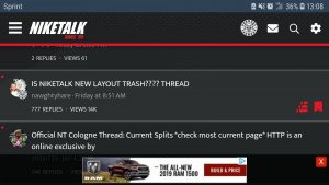
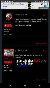
It's essential to listen to everyone's feedback, but we need to take a sober, measured approach, knowing that there will always be resistance to change. Historically, if we overreacted to the small but vocal group of people who bitterly opposed every single change, NikeTalk would still look like this:
 ..
..