Post Your New Eras*59-Fiftys*etc... VOL. INFINITY NOW W/ Henz0/Thunderchunk/Icy's FAQ ON PG.1

Ebay deals are to be had for days. It seems like people are too cheap to even want to drop current retail on a made in USA 100% wool gem. It hasn't happened yet or the market may just be so tiny but vintage hat prices really aren't that bad.

If I was a size 7 1/2 I'd be feasting.
 
So with all these older fitted we all like to pull out every so often what's everyone's method for fixing the "Pointy crown"?


with all the low crown talk and your question, ive been cutting the buckram liner out of my hats for years. takes a steady hand but ive done this to almost all the hats in my collection that have a high or off shaped crown.
 
Had to get another since it was on sale.
1200

Made in China. 100% wool 'custom'.

Fit, material, and look strikenly similar to my 1995 on field No complaints here.
 
WallyHopp That Indians joint is Fuego. That sz 8 remind me of when I had braids in High school. My sz would always be in the stores.
 
Any sz 8s out there, there's this seller out of OH who is selling some Indians diamond collection wools for $17.50 on ebay. Basically one left (after I scooped up two). I've dealt with them before and paid a bit more than what they are selling at now. So this is a heck of a deal. I've seen most of their hats just sit since I picked up my first set in early June.

Search INDIANS NEW ERA DIAMOND COLLECTION PRO WOOL and you should get one result.. Act fast. I didnt want to be a total hoarder. So I left one. I have been following them for awhile. They had never gone down below $28.
 
Last edited:
  • Like
Reactions: alp
Repped, ain't snatch the Indians one but bought an orioles 7 7/8 for the same price. 7 7/8 be fitting bigger then 8s sometime, so hope it's not too big for me
 
NE flag on the side for now.

2020 we are gonna have to see UA's ugly logo on the Unis.

Yeah, I cant believe MLB allowed NE to have their logo on the side of an on field hat. It looks terrible. And the thought of Under Armour putting their ugly logo on the MLB uniforms is sickening. I liked Majestics subtle logo, and have a feeling UA is going to try to shove their logo in our face and make it noticeably larger on the uniforms. :{
 
Friend picked this up for me in Japan. Black Yankee fitted, green underbrim, red white and blue mlb logo with the 78, 96, and top hat logo pins. Pretty pricey at $70, really disappointed that it fit small more like a 1/2 instead of a 5/8. I was gonna black out the NE flag with a fabric marker too


400

400
400
 
Had to get another since it was on sale.
1200

Made in China. 100% wool 'custom'.

Fit, material, and look strikenly similar to my 1995 on field No complaints here.


Where at? 8o

Just so you know. Retail to me is around $35 plus shipping. So with that said,

Just recently.. Ebay.. Search "Cleveland Indians Chief Team Logo Navy Blue Red"
$24.50 free shipping. I see two larger sizes left, 77/8 and 8. I truly only search around for my size so there may be more out there.

In the past, Iamchotofu has had 35-50% off bringing almost all on fields and customs down to $17.50-$22. Currently the '99-02 Indians navy/red custom is around $30 plus shipping on there. So not exactly a great deal.

I'm seeing a minimal stock at 4ucaps for the same cap at $35 MSRP, along with a 97 WS hat.. Hatclub has a $38 all navy 97 WS hat as well. Ebay also has it for $35 MSRP in a FSR.
 
Alright guys. Bear with me here
I had a chance to inventory and get some shots of my Cleveland Indians Collection. I posted this up about 3 months back, minus many hats. So heres the updated look

First, some pickups.. The ones I mentioned a couple days back arrived. 1995 on field, grey under, 100% wool, Made in the USA
1200

They still have original store tagging
1200


Now onto the complete collection

ON FIELD

1992 vs. 1995. The 1992 has a sort of rugged or raggy sort of Wahoo logo stitching
1200

I had to split this all up into the older era, and the more common era
1 1992 Home, and then the rest are 1995s on field
1200


Underside
1200


The beginning and then end of the light navy era
2003-2004 silver outline wahoo & 2003-2005 silver outline wahoo wool
2006 silver outline 'I' wool
2007 only year of the silver outline Wahoo with poly black under
2008 First year of white ouline with poly black x 2
2008 white outline 'I' poly
2010 cool base material white outline 'I' poly
2012-2014 lighter all navy
2015 DARKER NAVY Set
1200


Under side
1200


Navy/Red Set
1200


Evolution of Navy
1200


1995 vs. 2015
1200


Navy Set
1200

------------------
'I' Set
1200


Cooperstown/Custom
1200

1933 Cooperstown
1954 Cooperstown
1975 Cooperstown
1980 Cooperstown
1995-2002ish Custom x 3
1200


1995 WS patch custom
logo lush custom
dog ear custom (cut out flag & dog ear portion)
Packer shoes suede silver outline Wahoo
1200


1995 on field on the left vs. a 1995 custom and a dog ear 'custom'
1200

Probably the most accurate common day "custom" set you can imagine


Never really was a huge fan of current block C Cleveland Hats. I think my work here is done
 
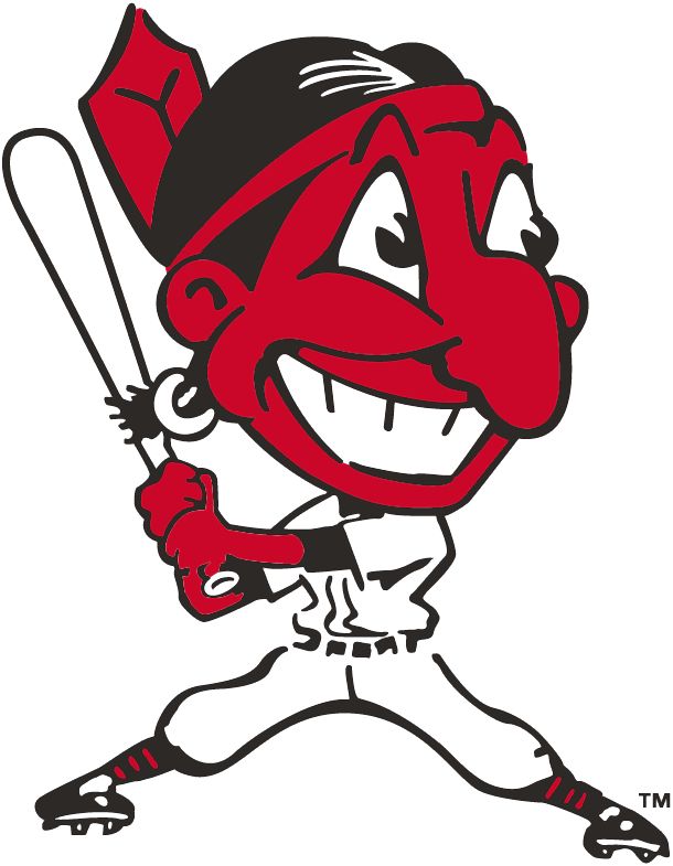
They need to bring back to big wahoo

I hate Cleveland but love the logo

Glad they went with the dark navy with the on fields finally

The lighter shade of blue they been using for awhile now was horrible
 
Flat logos are the truth. I don't see much added benefit with the Indians logo when they went "3d".

I want to say that it was added on most hats around 1996 and beyond. Many TBTC "retro" hats have followed through with the flat look. So it seems like the MLB is at least aware that its out there, and people do like the older look. Most China made customs don't go that far though. It's all 3d raised embroidery for the most part.

The older era definitely had a different stitch design. The teeth are in fact a touch thinner in appearance. Even 92 vs 95 were a bit different. I dont think you are too far off ninjahood ninjahood

green rhino123 green rhino123
I saw this hat on a website awhile back. Never really sprung for it, since its not officially a "on field"
1000


I get enough flak living in NM wearing regular Indians gear as it is. Let alone, anything custom. The yellow skinned logo seems a bit too racist imho

It all reminds me of the older Wahoo logo
6233ed0e4c81a70d3d980280c9cc42a9.jpg


I guess its the accentuated Nose that is a big deterrent overall.

The common day Wahoo doesnt "seem so bad" when its all said and done
 
Last edited:
I've got one of those original 2000s? Wools with the big wahoo and all navy

Great condition minus the sweatband is all yellowed

Gonna need to pull it out
 
Last edited:
Back
Top Bottom