- 93,972
- 33,001
- Joined
- Oct 24, 2010
at the price they are charging , they should be made in the usa
Lol
I remember when on fields were $24
Follow along with the video below to see how to install our site as a web app on your home screen.

Note: this_feature_currently_requires_accessing_site_using_safari
at the price they are charging , they should be made in the usa
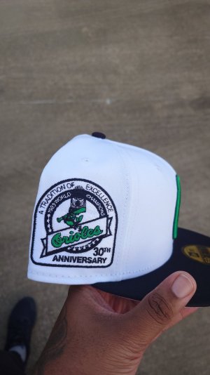
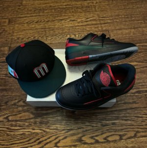
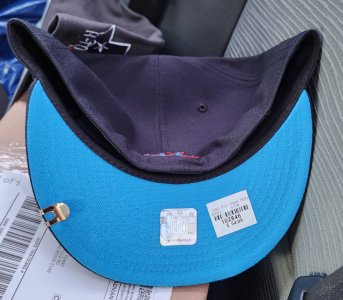
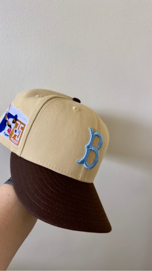
So with all these older fitted we all like to pull out every so often what's everyone's method for fixing the "Pointy crown"?
Lol
I remember when on fields were $24
Lol
I remember when on fields were $24
Lol
I remember when they were $15


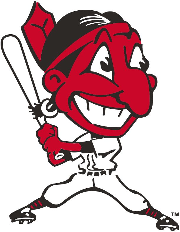
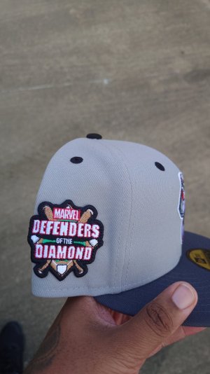
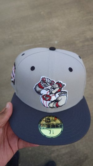
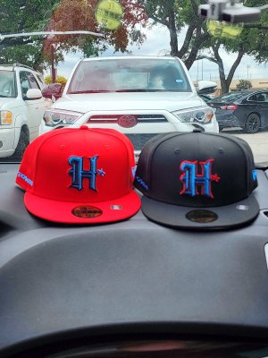
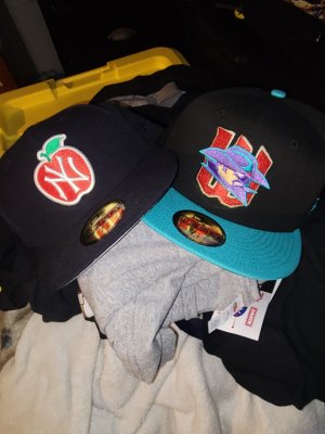
WallyHopp That Indians joint is Fuego. That sz 8 remind me of when I had braids in High school. My sz would always be in the stores.
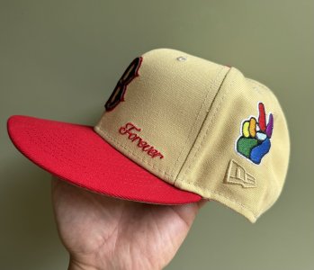
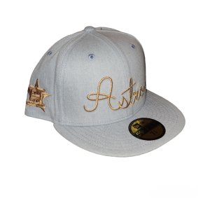
Had to get another since it was on sale.
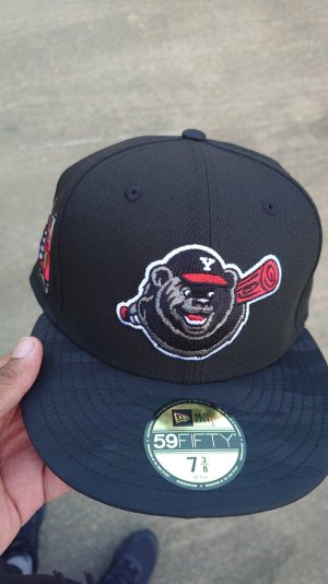
Made in China. 100% wool 'custom'.
Fit, material, and look strikenly similar to my 1995 on field No complaints here.

NE flag on the side for now.
2020 we are gonna have to see UA's ugly logo on the Unis.

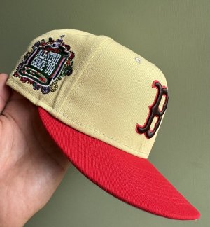
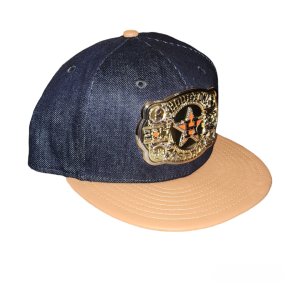
Had to get another since it was on sale.
Made in China. 100% wool 'custom'.
Fit, material, and look strikenly similar to my 1995 on field No complaints here.
Where at?