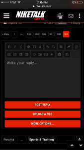
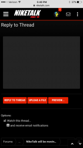
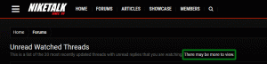
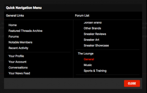
Once we had the tech in place for the nav menu, my operating assumption was that we should be able to swap things around in there fairly easily - without consuming dev/design bandwidth more urgently needed elswhere. They're essentially just links, right? Unfortunately, it's a bit more complicated than that, so it's not a quick fix - but it's an important one.
As everyone knows, there are workarounds. There are other locations you can use to access the forum directory, and you can bookmark the forum directory quite easily.
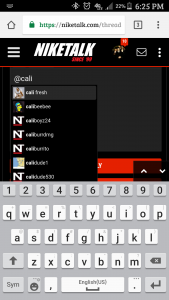
https://niketalk.com/forums/
"Can a user technically accomplish this" is not the bar we're trying to clear, though. We want it to be easy and intuitive to do whatever you want on the site. We'll get there.
On beta, we had a forum directory on the front page instead of the featured content, so it was less of an issue there. A big push was made very late in the process to get the front page featured content in - because it's VERY important for people who are
not forum regulars to find what they're looking for right away without having to dig around through thousands of posts, as is a common limitation in forums. First impressions matter, and a front page that isn't a text menu is important. New users want to know where to talk about that next big release, or to see the latest news.
Unfortunately, in the current version of the platform, we can't easily customize the front page to show featured posts AND, say, your personalized news feed, or a forum directory, or the "what's new" content. I want that to happen, but that's something that will need to be handled further down the road.
I'm hoping that before the month is over, we can get the navigation menu to a much better place, so you can just jump from one forum to the next without having to go through some intermediary directory page.
What I hope gets across is that we're constantly moving in the right direction.
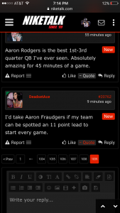
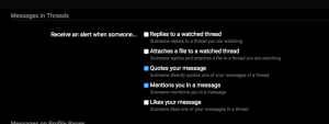
Re: the red bar... meh. Everyone liked it in beta. It's one of those things where you establish a table style for the various modules and those style settings apply to all similar units. It's a matter of personal preference. I can see why some would rather only see it as a way to establish clear separation and pop for different forum categories and those types of modules rather than for every single post on a page.
I can't promise we'll remove it, since it is a personal preference thing and the jury is still out.
What I can say is that
1) It isn't present on mobile.
2) We'll have a light theme next year, to give you an alternative.
3) We may at some point in the not
too distant future give people the option to "force mobile" or "force desktop" rather than use the default responsive design that automatically fits your display.
We were caught a bit off guard by the number of users who for some reason wanted to know how to switch to desktop or mobile mode. We thought we'd obviated the need for that sort of toggle by establishing a unified design that is fully featured on all platforms.
Traditionally, you'd toggle to desktop on mobile if you wanted to use a feature that was desktop only.
What I've learned is that there are some users who preferred one or the other view just for layout reasons. They liked the look of one or the other.
So we should in theory be able to create separate theme options that stay locked in "desktop layout" or "mobile layout" at all times. If that happens and you were to choose mobile mode, no red lines.
To be perfectly clear, then: the tool can only be used once per account. That's true for any change - whether you're changing the formatting or the name in its entirety.
Probably not that difficult, but, as with the red lines, it's a style preference right now and it's something that I think is really more of an issue for lower resolution mobile devices that are a little shy on screen space. So the question is whether we want to strip down the look on mobile for just those users. It's arguably a temporary and limited problem.
Perhaps we can tweak it so there's a little less padding between the avatars and the text.
The avatars aren't purely cosmetic. When you post in a thread, a little version of your avatar appears alongside the OP's avatar. It's kind of like - for anyone who actually remembers ezboard - those little 10x10 pixel user icons we used to have in the old days. (I had the NT logo, others used city initials, etc.) So it does have some functional value in addition to adding a little visual interest to what would otherwise just be a lot of text. And I, as well as anyone, know what people tend to think of long blocks of text.
These days, a lot of web traffic actually comes from automated web crawlers and such:
http://www.robotstxt.org/
On the old system, the visits generated by these programs would be counted as a "guest." Now, we can have a more accurate idea of how many
people are online.
It's useful, but I know the "robot" nomenclature isn't self-explanatory. It's inside baseball, in the sense that it's a specialized term pertaining to something that was boring to begin with.
As is too often the case, "robot" sounds like a lot more fun than it really is.
 e
e