- 13,131
- 10,676
- Joined
- Feb 7, 2016
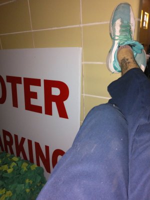
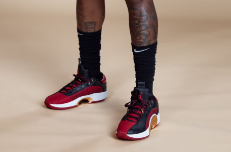
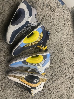
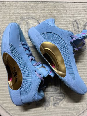
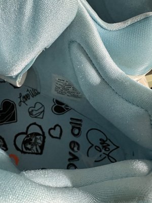
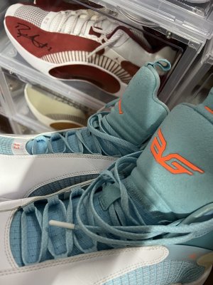
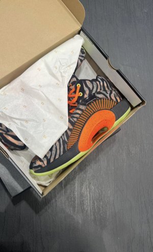
Melo logo is one of the sickest logo as far as doning the Jordan brand comes. shout out to the Maestro 2s. love those a lot as far as stle and performance is concerned. criminally underrated.
Follow along with the video below to see how to install our site as a web app on your home screen.

Note: this_feature_currently_requires_accessing_site_using_safari
Melo logo is one of the sickest logo as far as doning the Jordan brand comes. shout out to the Maestro 2s. love those a lot as far as stle and performance is concerned. criminally underrated.
You'd think Nike could make him some PEs capable of withstanding his brute force. Especially in light of what happened to his shoe that one night at Duke. On top of the safety aspect, it's not going to be a good look the night he disintegrates the flagship Air Jordan, which would be covered endlessly on every media platform LOL
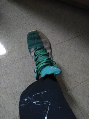
cringy? it's a tramp stamp.Melo logo look like a cringy tattoo imo...
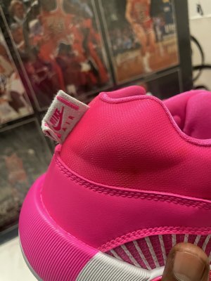
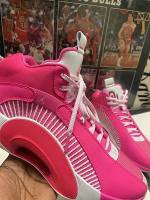
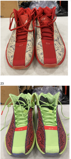
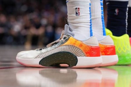
I like the 34 better. The 35 could've been sick--and I'm just talking looks-wise here--but the released colorblocking doesn't do much for me. Also don't like the giant plastic eclipse plate circle on the lateral side. But some of the PEs, including that Melo PE above, incorporate it way better by having contrasting paint on the center of the midsole and the front and rear of the midsole, which is part of blending the plate into the shoe as more of a visual design element. That Melo PE also proves to me that my thought was correct: they look better when the upper suede/leather panels look connected rather than broken up by that usually shiny piece with the Jumpan. The piece on his pair looks white, so it blends in with the two panels where they come together. They should've made it all one piece in the first place and not broken it up with that connector piece. And the black tongue and toe with white panels surrounding it works better than what they did with the released DNA pair. They should've reversed the blocking on that pair, it would've made it resemble the black-toe 13.
I agree. The contrast midsole with the muted “bridge” connecting the upper panels is the best chance at giving the shoe flow. Not sure why they’re paying Kemy what they do for her to ....design dope PE mocks? Exactly how does the brand make money from that? They’re paying millions in endorsements but leaving money on the table with these weak retail drops.I like the 34 better. The 35 could've been sick--and I'm just talking looks-wise here--but the released colorblocking doesn't do much for me. Also don't like the giant plastic eclipse plate circle on the lateral side. But some of the PEs, including that Melo PE above, incorporate it way better by having contrasting paint on the center of the midsole and the front and rear of the midsole, which is part of blending the plate into the shoe as more of a visual design element. That Melo PE also proves to me that my thought was correct: they look better when the upper suede/leather panels look connected rather than broken up by that usually shiny piece with the Jumpan. The piece on his pair looks white, so it blends in with the two panels where they come together. They should've made it all one piece in the first place and not broken it up with that connector piece. And the black tongue and toe with white panels surrounding it works better than what they did with the released DNA pair. They should've reversed the blocking on that pair, it would've made it resemble the black-toe 13.
Melo logo is one of the sickest logo as far as doning the Jordan brand comes. shout out to the Maestro 2s. love those a lot as far as stle and performance is concerned. criminally underrated.

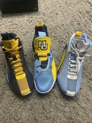
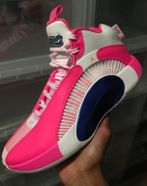
San Diego State University PEs
Who is Kemy?I agree. The contrast midsole with the muted “bridge” connecting the upper panels is the best chance at giving the shoe flow. Not sure why they’re paying Kemy what they do for her to ....design dope PE mocks? Exactly how does the brand make money from that? They’re paying millions in endorsements but leaving money on the table with these weak retail drops.
My shipping is live and my pair arrives tomorrowToday should be DSG shipping day on Breds. If someone gets shipping, please post.
Them having a FSR for so long while other site's dropped sizes has me looking a little side-eyed at them
Amy Kelsey, aka 'Kemy'. Promo PE Designer. She's on IG "kelshmeamy". She does excellent work for their athletes....and that's about it ..Who is Kemy?
My shipping is live and my pair arrives tomorrow

In store onlyNo Titans today huh? Anyone know the new release date?
In
In store only